Sales Management App
2021
15 Weeks
Mobile App
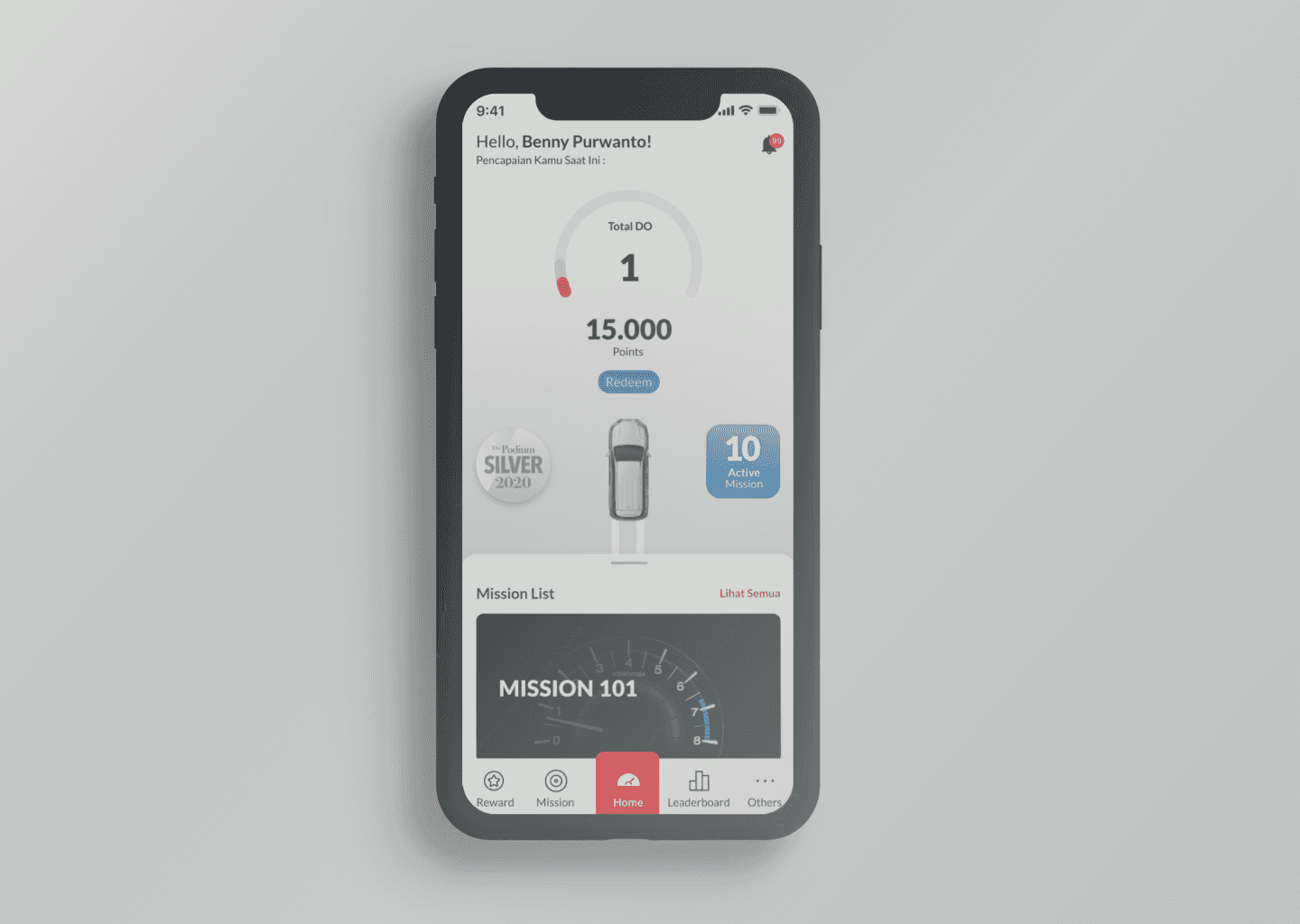
Sales Activity Management is an application to monitor sales activity to understand team milestones and performance. During this project, we added rewards features to the app to improve transparency and motivate users through gamification.
Deliverable
User Interview
Persona
Information Architecture
User Journey
Wireframes
High-Fidelity Prototype
Team
Project Manager
Business Analyst
Interaction Designer
Visual Designer
Objectives
Our client wanted to improve their existing sales activity management and to create friendly competition between the team.
Research
During the research phase, our aim was to understand the existing app, what are the pain points of the users and how can we motivate users to improve their productivity. We conducted a heuristic evaluation for existing apps and interviewed existing users to identify user goals and pain points.
User Interview Findings
Our users initiatively taking chance to get closer with customers by adding their social media and giving greetings when it’s the customer’s birthday.
There are no strict rules to get customers. Every salesman has their own strategy to reach customers.
Leaderboard to remain competitive and stay afloat. The leaderboard is able to motivate salesman to be more productive, however, it’s not enough to keep the competition interesting.
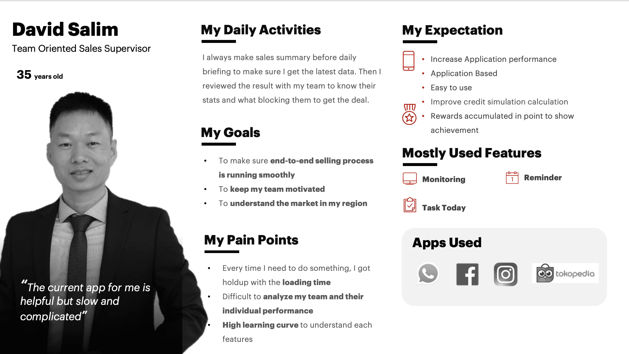
The current app was unable to give the supervisor quick insights and a summary of their team status. They are required to summarize and analyze themselves with other apps/software.
Persona
Based on our interviews we created personas that represent the three user types: highly motivated salesman, team-oriented team leader, and family focus freelance salesman.There are no strict rules to get customers. Every salesman has their own strategy to reach customers.
Design
Information Architecture and User Flow
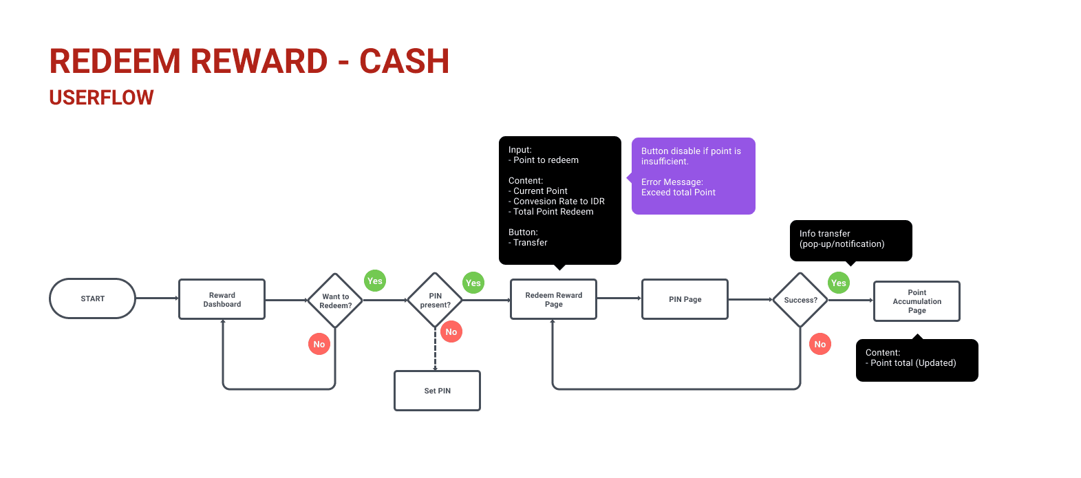
During the design phase, we created information architecture and user flow before we started designing the UI. This helped us understand the hierarchy and how business requirements mapped for every journey.
Wireframe
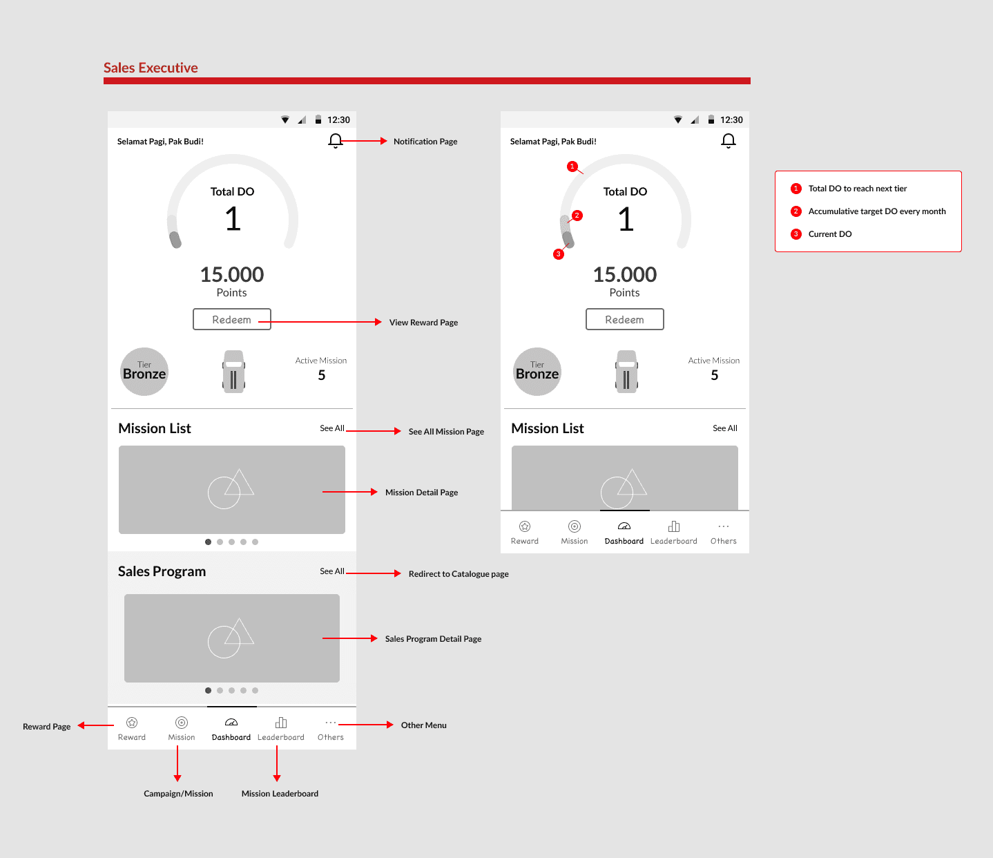
After the information architecture and user flow are clear, we built our wireframes. This wireframe helped focusing the discussion on the content and information hierarchy than the visual. During this process, we did 4 weeks design sprint where I was in charge of creating the wireframe before giving them to visual designers.
High Fidelity Prototype
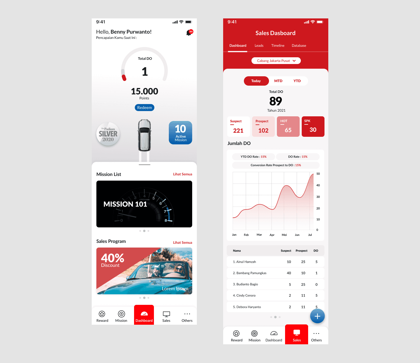
For high fidelity prototype, we are using the company’s design guidelines including the color and the fonts. This helped to give brand consistency across other company’s apps.
Test
After we created the high-fidelity prototype, we conducted usability testing. Our goal was to understand how users interact with our design and to identify any issue that prevents the user from completing the task.
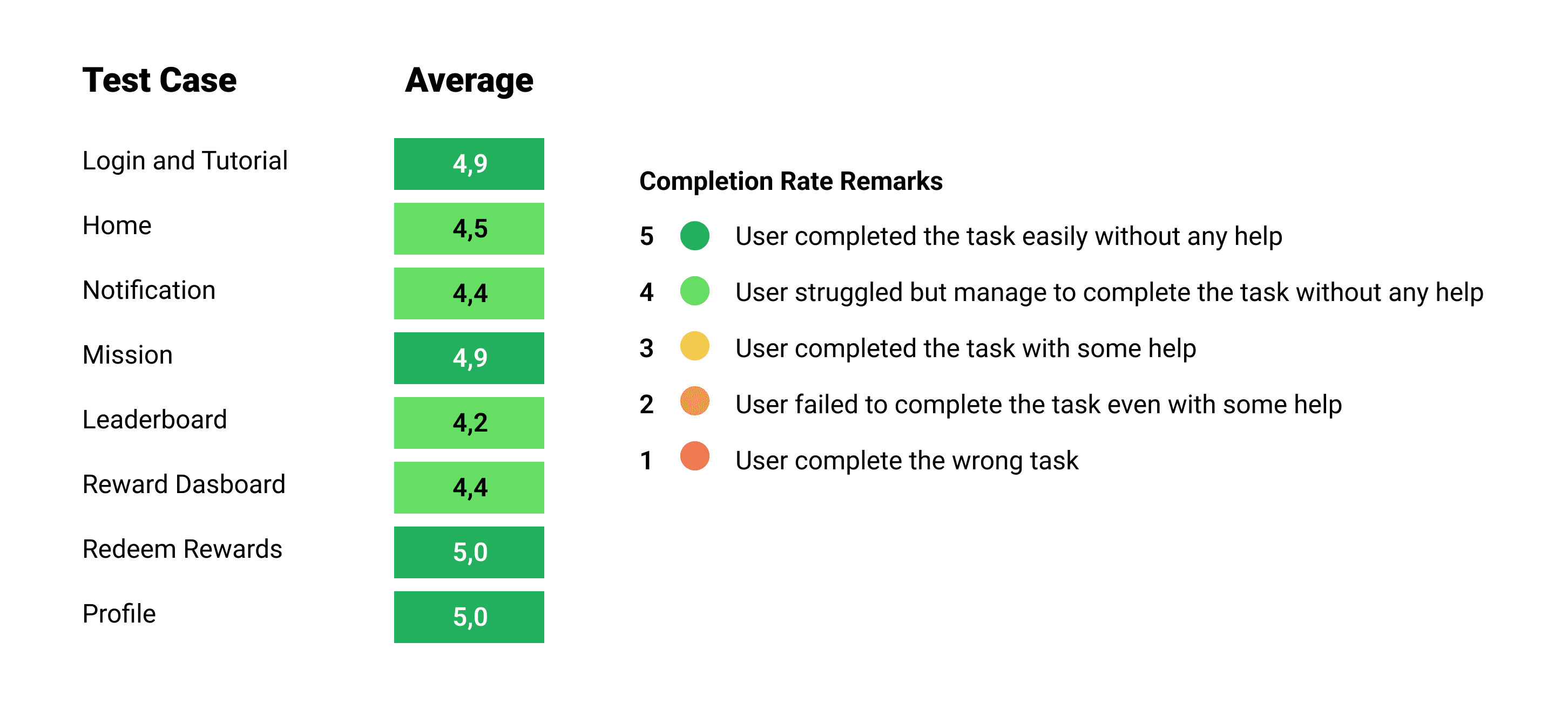
We prepared 11 scenarios to test with 8 participants. We measured their completion rate for each scenario and asked for their feedback on the overall experience on every test case.
Based on this usability testing, we found that some terminologies are not clear enough for users to understand. We changed the terminology to be more user-friendly (e.g change from English to the Indonesian language) and gave information like a glossary to help users to understand when they need it.
Conclusion
Our design was able to improve the usability of the app. The sales dashboard was able to help the sales supervisor to give a straightforward analysis of the team performance, and the design got great feedback from the users.
During this project, I learned that having clarity of the project scope, and requirement and involving clients, and the tech team from the start help to achieve common ground and goals, and help to deliver the result on time with a satisfying result.