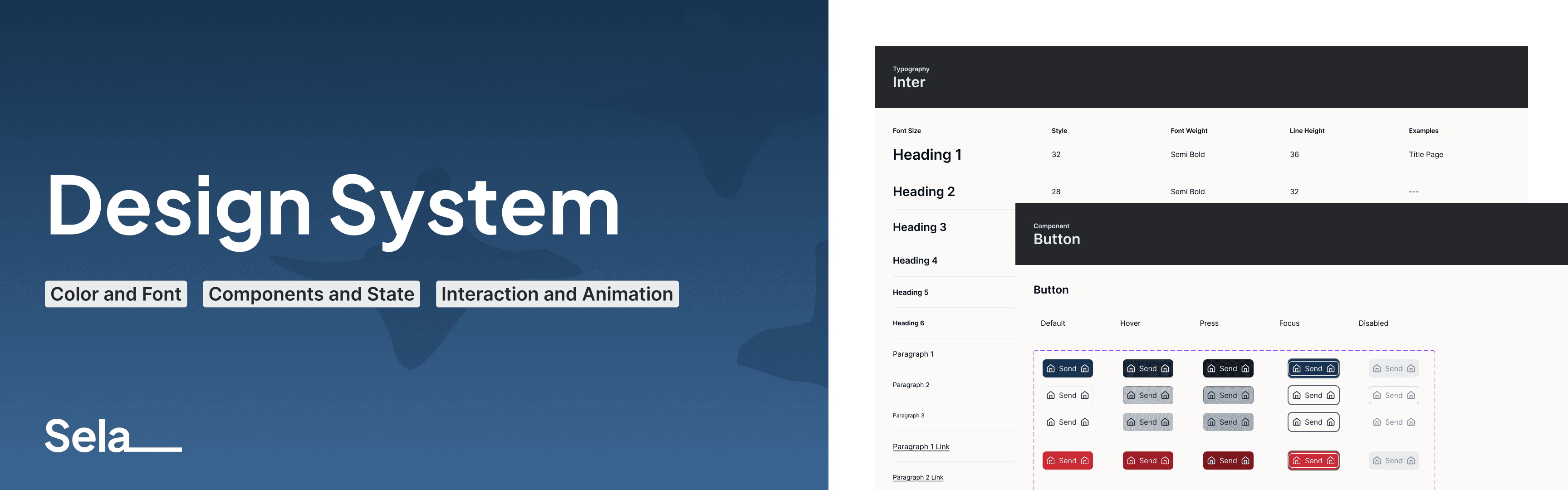
Design System
2026 On Going
Website
I started this design system as a personal project to explore interaction patterns and system behaviors I didn’t get to fully work on before—especially in more complex B2B environments.
As many design system, this is a living system and far from finished where tweak and changes often necessary. I treated it like a real product and will use this for use case I felt interesting. I designed components, patterns, and interactions that could support multi-step workflows, data-heavy interfaces, and all the edge cases that come with them.
Here is the Design System Link (Figma).
Deliverable
Colors and Typography
Variables and Tokens
Components and States
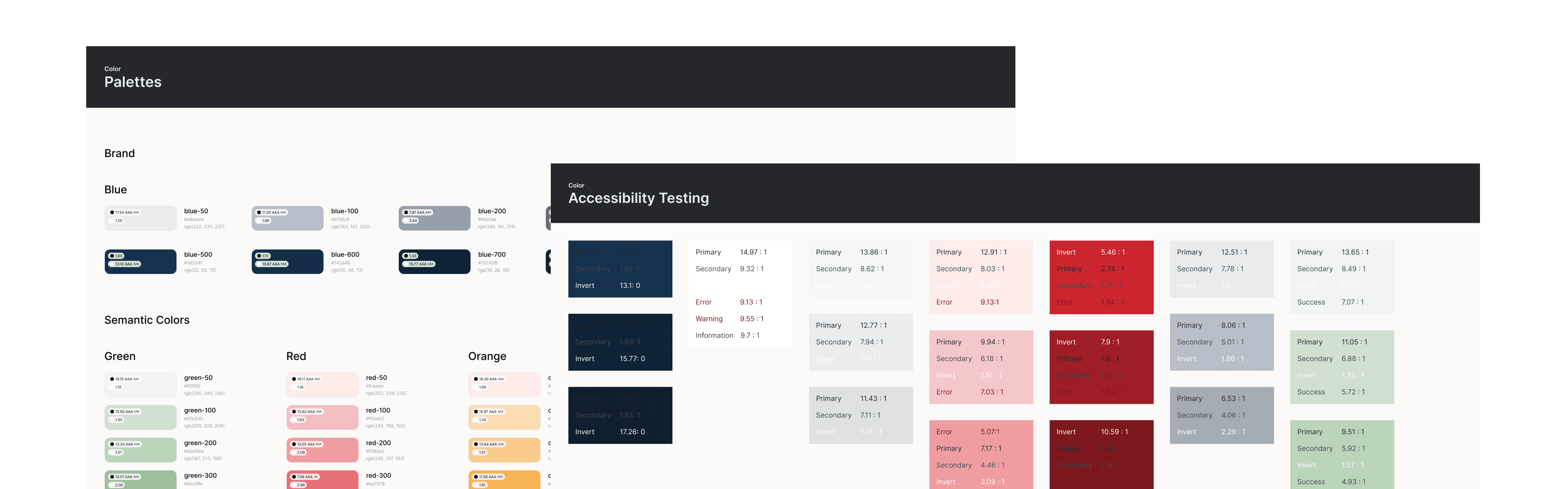
Brand Colors
For the brand color, I chose a neutral and modern blue with the idea that the platform would be used for technology or education purposes. Blue is often associated with trust and dependability.
After that, I selected neutral grey tones and semantic colors such as error, success, warning, and information states. In Figma, I used Foundation Color Generator plugin to create the color palette. After adding all the colors into variables and setting themes for each function, I tested the accessibility using Stark plugin.
Typography
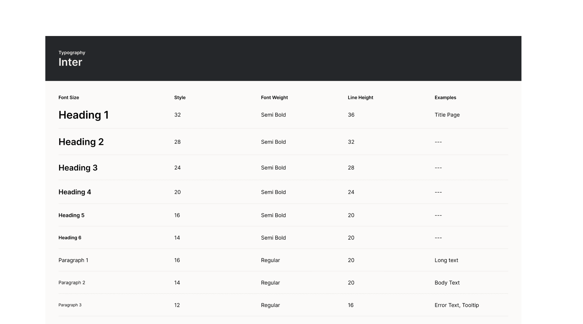
For typography, I used Inter due to its clean shapes, Google Fonts availability, and wide range of font styles, which make it flexible and easy to use across different variations. I used the Major Second scale, as it keeps the typography hierarchy clear without feeling too large for a data-heavy interface.
Design Tokens
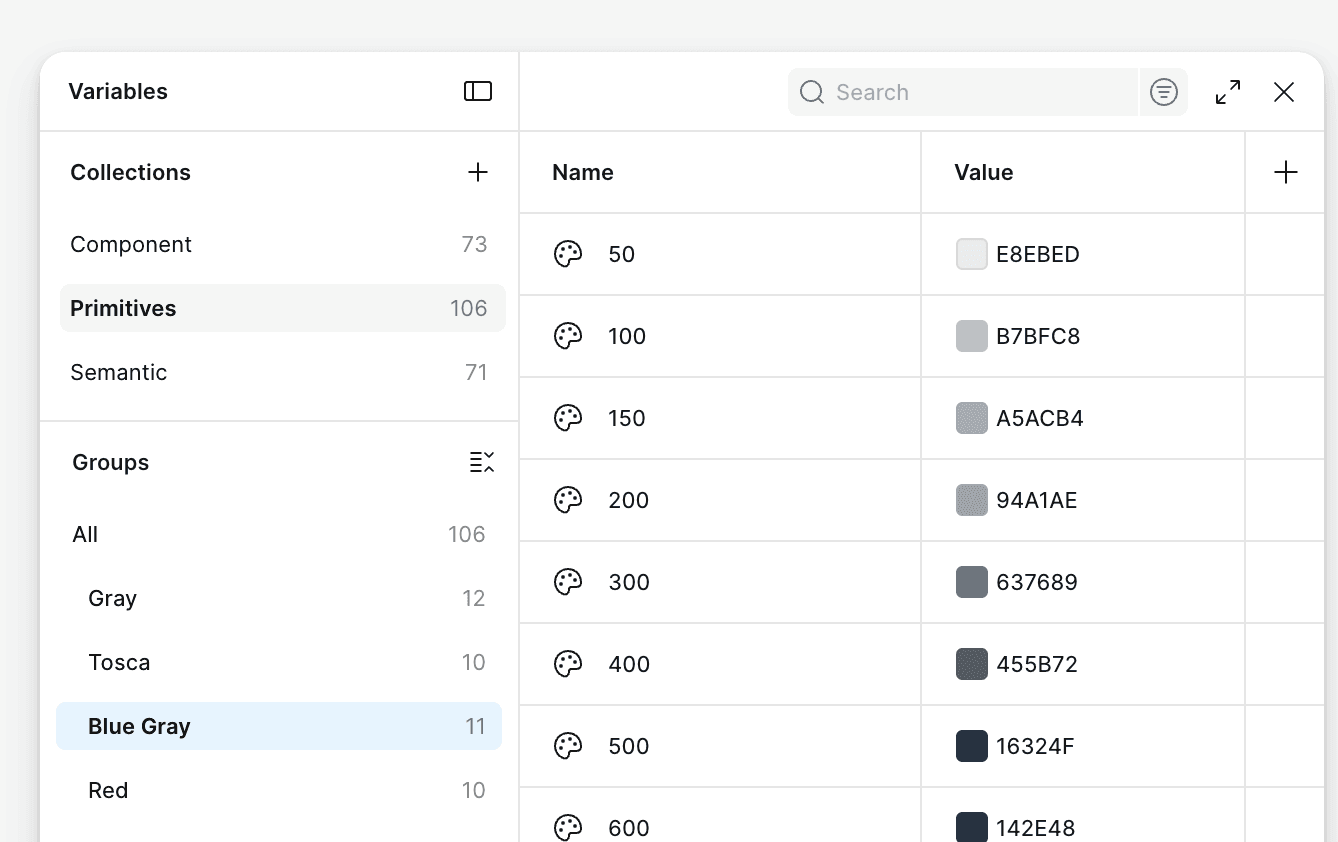
Design tokens help create a shared language between designers and developers, reducing ambiguity, improving consistency across teams, and making handoff faster. As a designer, having clear token naming also makes the system easier to build and maintain, reduces mental load when working on complex components, and supports better collaboration.
The most common approaches use either two-level or three-level token mapping. For me, three-level mapping (primitive, semantic, and component) provides more flexibility and supports a wider range of component use cases.
Components and States
I started with basic components like buttons, avatars, and tabs, and as the use cases grow, the components will continue to evolve over time.
Avatar
Banner
Button
Cards
Checkbox
Radio
Tabs
Tags
Text field
Tooltips
Select
Switch
Skeleton
etc.